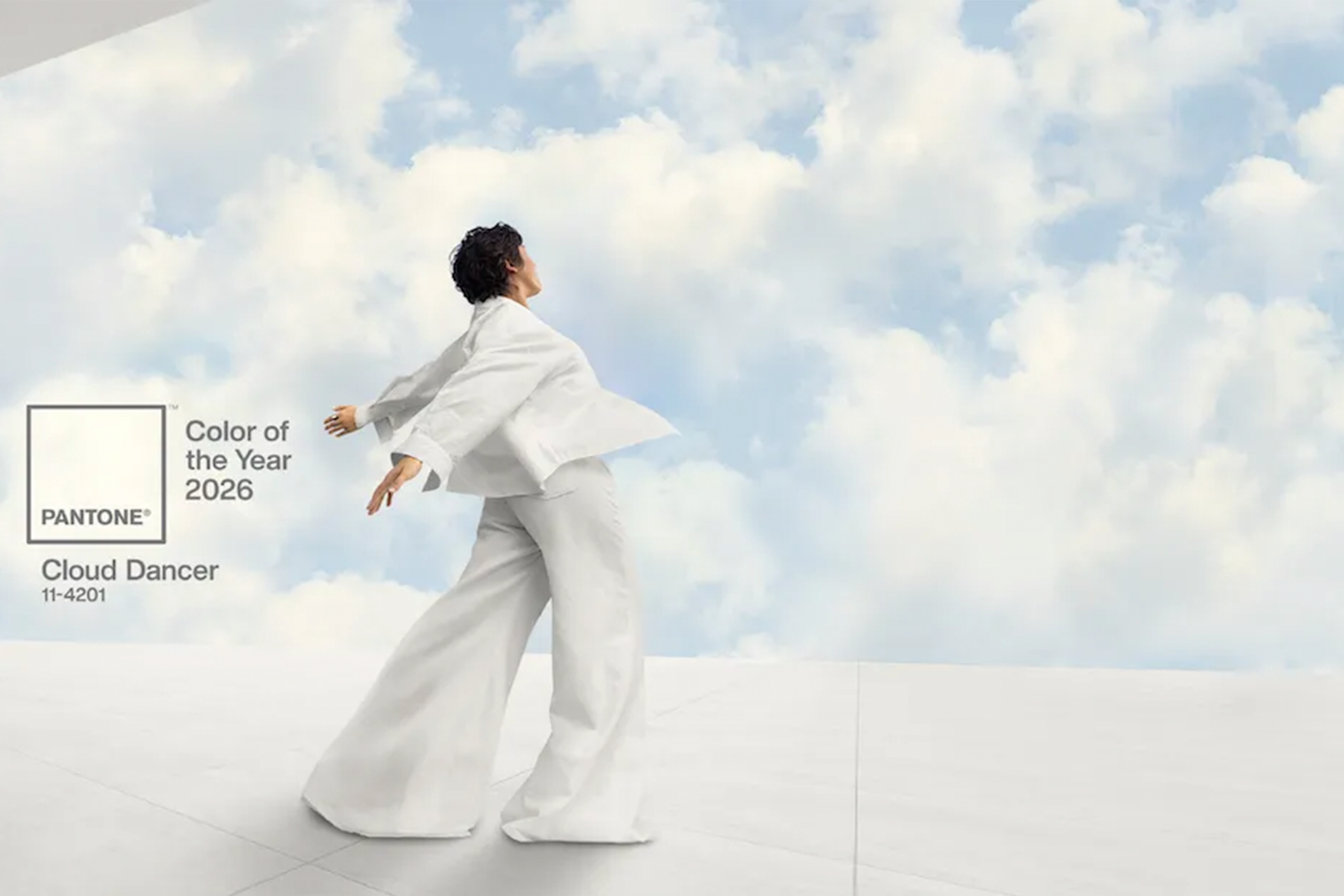
There’s also a quiet irony in naming a shade that is technically not a color as the industry’s most important color of the year. For a company that positions itself as the global authority on color psychology and cultural trends, the decision feels unusually evasive. Instead of reflecting the complexity of the present moment, Cloud Dancer smooths it over.
Pantone has previously embraced emotionally charged choices bold pinks, grounded browns, expressive hues tied to cultural movements. Against that history, Cloud Dancer feels safe, cautious, and deliberately unprovocative. In a time when design is increasingly expected to be conscious, responsive, and culturally literate, neutrality itself becomes a stance.
If color is a language, then Cloud Dancer speaks softly perhaps too softly at a moment that demands clarity, courage, and intention.